I’ve been asked again about adding a Mobile Friendly WordPress Plugin is a good solution for the new Google requirements. It’s likely that if you have a customized WordPress theme, a responsive plugin will not produce satisfactory results. This post will show some examples.
Using a Mobile Friendly WordPress Plugin
I took some screen shots of a live website on an iphone (I’ve wiped out the identifying features). Although Google doesn’t recognize this as a “mobile friendly” site, it’s still attractive on a smart phone, and attractive is what most website owners want.

Adding a Mobile Friendly WordPress Plugin will make a site compliant with Google’s guidelines for responsive website design. HOWEVER, it’s likely you won’t be happy with the results. The plugin itself needs styling, other plugins in use may not be responsive and will have to be deleted and new ones installed that aren’t in conflict with the mobile friendly plugin, and then reconfigured.

You’ll notice too that some of the things you’d expect to see on your site have disappeared. Little things? Well, how about your logo?
More Plugin Problems
Another site shows how dramatically your custom formatting and some pretty important stuff can disappear. Let’s start with a “before” plugin screen shot. I’ve added a big orange arrow to show placement of a Google ad under the site logo and menu.
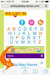
And now for the “after” plugin screen shot. Ugh! No more logo. The mobile friendly plugin adds some of it’s own design elements that need to be reconfigured… mint green bar, gray background that makes images with white backgrounds look like a cheap paste job. Remember the big orange arrow? Yup, the Google ad drops off the site! If your site earns revenue from ads this can be a disaster.

I know the idea of a web redesign can be a big fat pain. However, I’m recommending to clients with highly customized WordPress websites that they consider moving to a truly responsive them rather than adding a plugin. With WordPress, your content is already created and stored in the database so you aren’t having to re-write and start from scratch. Contact me at Design to Spec for customized mobile friendly, responsive website design themes that can look a lot like your current WordPress site.
